ForumsNewsNew Icons
New Icons
| Author | Message |
|---|---|
|
Jake Toodledo Founder |
We have made a few small changes today to the icons that you use in the Tasks section.
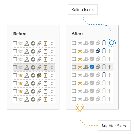 The biggest change here is that instead of using two separate icons in some cases (ex: task has a note and task doesn't have a note), we are instead using one icon and allowing color to do the differentiation. This was done to streamline the tasks and make it easier to see when a task has a note/attachment/etc. We are also using our new standard icons that we use elsewhere on the site. These have several advantages: looks crisp on retina devices, prints better, loads faster. |
|
Salgud |
This all seems ok, but there is no longer an option to create subtasks, and no way to view them. I looked all over and searched the News forum for some notice of a change, tut didn't find anything. Is this going to be added soon I hope?
This message was edited Sep 16, 2015. |
|
DanH_2 |
I do see an option to create subtasks -- it's under the main, down-pointing "action menu" icon, where it always was.
|
|
franois_chabot |
Hi one issue is that you don't see prior to reload that the ''starred'' is selected i.e. yellow
I just went back and now it is ok and icon are great This message was edited Sep 16, 2015. |
|
jgpacker |
The star looks great. Sometimes I would find it a bit odd and not be sure why.
The dropdown menu icon is much better. I always thought it looked like a "share" icon before. |
|
Chris |
The ">" button you press to unfold a task so that you can see the details...once you've unfolded the task, the button disappears and there's no way to fold it back up again without reloading the page. Please tell me this is another error that will be fixed quickly rather than a design choice...
Also the fonts are now enormous and the sidebar width can't be adjusted, so far too many things get truncated, making it difficult and time-consuming to work out what's what. I'm sorry, I shouldn't be so grumpy. It's just a nuisance when you've tailored your workflow to how things used to be for so many things to be changed, seemingly every time I log on at the moment, often breaking the workflow. This message was edited Sep 16, 2015. |
|
Jake Toodledo Founder |
Chris, the > button should definitely still be there (point down like a V) after you click it. And the font's should not be enormous. It sounds like maybe your web browser is behaving strangely. Can you please create a support ticket and attach a screenshot so that we can see what you see and help get this fixed? http://www.toodledo.com/info/ticket.php
|
|
Chris |
The font size increase was some weeks ago now; I'm sure it was deliberate. I've sent a snip of the > problem by support ticket (see bottom task); what you describe is how it worked until now. I'm pretty sure it's not a browser problem. Either way though, I'm sorry, I don't have time to get into this at the moment. Thanks for replying so quickly.
|
|
Christoph Dollis |
Good changes.
|
|
Dave |
You're doing a great job of improving the look and functionality of the site. I appreciate the work that you are doing!
|
|
Salgud |
I figured it out, my subscription expired while I was away. Of course, I thought I'd get a warning from TD, but didn't for some reason.
This message was edited Sep 17, 2015. |
|
pawelkaleta |
New icons are ok
|
|
Dave |
The new blue icon pointing down makes a lot more sense than the old one. Great job
|
|
coolexplorer |
New icons are fine.
Would like a clearer distinction between a Parent & Sub-tasks particularly when they are Inline. The organogram symbol confuses me with their filled dots and looks a bit aged and bureaucratic, for want of a better term. I currently add + in front of each of my Projects to distinguish them. How about a big '+' sign for a Parent, and a '-' sign for sub-tasks. That would be more contemporary and intuitive. Now may be the time to add power to the Task check-box by adding a clickable multi-select feature, instead of the time consuming New search & Multi-edit. Normal click will mark the task as done & Crl+click, click, click would mark multiple tasks as selected for further action i.e. Multi-edit eg. delete, copy, change a field value, mark stars, etc. Note: 'Ultimate To-do List' Android App has this great feature, and it is a productivity booster. This message was edited Sep 18, 2015. |
|
garyo |
Love the new icons, especially the note one which wasn't very clear in the old interface. Except, the star used to be empty when inactive and filled when active, and now it's barely distinguishable unless your color vision is perfect. Could you consider colorblindness and make the empty star lighter (or ideally empty, just outline as before)? The note and down-chevron icons are a good model, they really stand out when turned on.
|
|
Jake Toodledo Founder |
Based on your feedback, we have made a few changes this morning to the icons. The note and star icons now have a shape as well as a color change. This will make it easier to see whether a task has a star or note.
We have also made some minor refinements to the checkbox icon and adjusted the spacing between rows to fit more tasks on the screen. You may need to refresh the page to get the new icons. This message was edited Sep 28, 2015. |
|
Christoph Dollis |
Thank you so much for returning to "hollow/outline" icons for unstarred and no notes. This makes it possible to use Toodledo when using f.lux's "darkroom mode". I.e., red and black. Also, I like having more tasks on the screen. I think you've done a great job with this improvement!
This message was edited Sep 28, 2015. |
|
Hugh O'Donnell |
Really like the new look and functionalilty. I'm not a "power user," but I do appreciate ease of use!
|
|
Tracie2602 |
Loving the new changes
|
|
kerrinhardy |
I just wanted to add my voice here too as I am also loving all the new changes!!!
|
You cannot reply yet
U Back to topic home
R Post a reply
To participate in these forums, you must be signed in.