ForumsNewsTasks Redesign (part 5)
Tasks Redesign (part 5)
| Author | Message |
|---|---|
|
Jake Toodledo Founder |
This is the last in our 5 part series of redesign changes that we have made to the Tasks section (Part 1, Part 2, Part 3, Part 4). This doesn't mean that we are finished, just that we have reached the end of this particular phase. Please read on for a list of what has changed in this release.
Search Updated 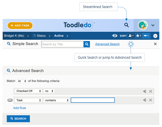 We have cleaned up and streamlined the search functionality for the Tasks section. The "Quick Search" tool is still on the right side of the page, like before, only it has moved up about an inch to live at the top of the page. We've turned into a button and renamed it "Simple Search". To perform a "Simple Search" of the tasks on the screen, click the new button. The cursor is automatically placed into the revealed search box, so it's still a one-click action. If you have keyboard shortcuts enabled, you can still press the "F" key to enable this tool (F for find). The new "Simple Search" bar now has a link taking you straight to the Advanced Search page if you need to do a more serious search of your tasks. On the Advanced Search page, it's now easier to save, modify and delete saved searches. One improvement that we think will be popular is the ability to quickly save changes to an existing saved search. Now, when you modify a saved search, there is one button to save those changes to make them permanent. There is another button that will save the changes as a new saved search if you prefer the old behavior. Batch Edit Everywhere 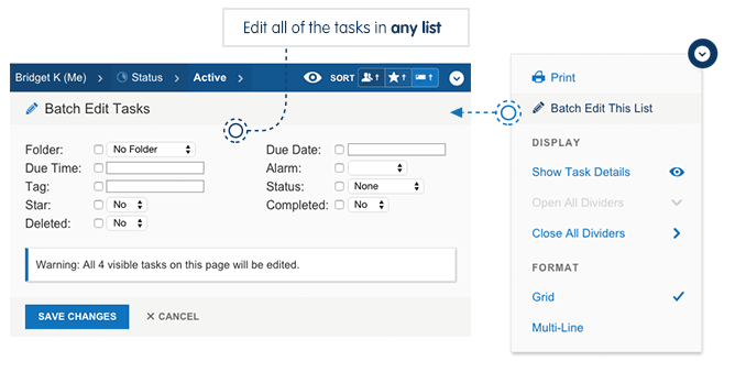 We have renamed "Multi-Edit' to "Batch Edit" and made it available everywhere (it used to be available only in the Advanced Search section). With this upgraded tool, you can now Batch Edit the tasks in any list that you are viewing. For example, you could go to your "overdue" list and quickly move all the tasks forward to tomorrow. We have also cleaned up the interface for this, so its easier to use and takes up less space on the screen. Quick Add We have moved the "Quick Add" tool and restyled in, but its functionality is currently the same as before. We have some big plans for this "Quick Add" tool. In the near future we'll be updating this tool with power users in mind. You'll soon be able to use special commands to quickly add a task with more than just a title. This will be similar to the way you can fill a task's details when emailing a task into Toodledo, only much better. Conclusion We knew that this entire redesign (all 5 steps) would change a lot of things and that if we did it all at once, it would have been disruptive. This is why we broke it up into phases. Now that it's complete, you can see how far we have come with these before and after shots. 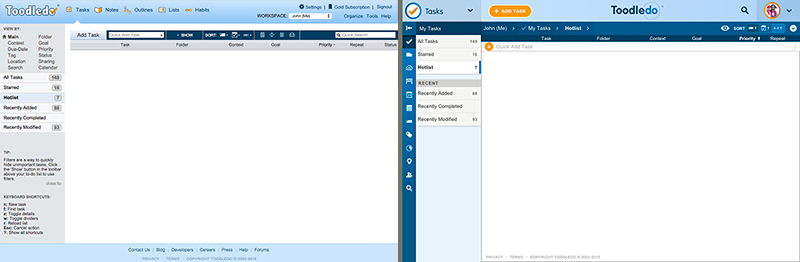 As you can see, we have greatly streamlined the interface, improved our use of color, better organized the various functions and updated our whole look to be more modern and approachable. We have also made it so more of your tasks fit on the screen at once. Our goal was to make Toodledo look better and be easier to use, and we think that we have achieved that. We understand that these changes (as with any change) may require some relearning of behaviors, but we are confident that everyone will adapt to the new locations of things and using Toodledo will be more enjoyable and productive. Now that we have gotten the structural changes mostly completed, we are going to turn our attention towards upgrading individual elements of the Tasks section. We already mentioned the upcoming improvements to the Quick Add box, but we also have plans to overhaul all the popups that appear when editing tasks to make them more powerful and easier to use. We really want to know what you think. Please let us know here or in a support ticket if you have any constructive feedback. |
|
Scott Buscemi |
I would love to be able to type in "Tomorrow" or "Friday" into the due date and have it automatically calculate the proper date.
|
|
Jake Toodledo Founder |
Scott, It already does this. Give it a try.
|
|
akorvemaker |
Overall I have been very pleased with the redesign and with the process. Thank you! You're doing good work.
The only time I found that one of the changes was actually disruptive (as opposed to "different but I'll get used to it") was when the Add Task button was moved to the right side, but you quickly changed that in response to feedback. I felt that the gradual process, with each step explained, worked very well for these changes. |
|
Adrien Beau |
Excellent work, Batch Edit being available in all views is awesome! The before-and-after screenshots shows impressive progress. Modernizing an UI without losing usability in the process is a rare feat that you can be proud of!
A nitpick: the new Quick Add Task "+" button is slightly too big. I understand you wanted to make it prominent, but the way it touches the borders of the Quick Add Task area bothers me. Reducing its diameter by a couple of pixels would look much better to me. |
|
Salgud |
I appreciate your approach, it made adapting to the new format much easier than it would have been had you changed it all at once. This latest change to Searching will take some getting used to, but I can already see that it's much better than the old way.
Thanks for all these improvements. I look forward to the upcoming ones you've mentioned. O yea, it does look MUCH BETTER! |
|
Dave |
I like the changes and love the Batch Edit functionality. For the streamlined search, I have a small suggestion. When you click on the magnifying glass next to the ToodleDo logo, it opens up the advanced search entry area (I'm doing this while already looking at a specific search). Unfortunately, there is no way to close the search entry area without refreshing the screen or running a search. Could you possibly enable a click on the magnifying glass again to close the search entry area if it is open?
|
|
Salgud |
Posted by DrFrankBuck:
Posted by Dave: I like the changes and love the Batch Edit functionality. For the streamlined search, I have a small suggestion. When you click on the magnifying glass next to the ToodleDo logo, it opens up the advanced search entry area (I'm doing this while already looking at a specific search). Unfortunately, there is no way to close the search entry area without refreshing the screen or running a search. Could you possibly enable a click on the magnifying glass again to close the search entry area if it is open? There is an "X" at the right-hand end of that line. Clicking it closes the search. I'm with Dave. I don't have the "x" on the right. Using Chrome 46.xxx. I tried expanding the screen, but still not there. |
|
Dave |
I just verified that the "Cancel" option does not appear next to "Advanced Search" in Chrome, but it does in FireFox.
|
|
Jake Toodledo Founder |
If you have clicked the "New Search" button to start doing a new advanced search and you change your mind and dont want to do that anymore, you can click one of your existing saved searches to make it go away. We'll fix the cancel button
|
|
boydston01 |
Seriously, toodledo is awesome. So superior to so many other—more expensive—options.
This last redesign made it more apparent (to me anyways) that saved searches are not "regular" lists. I now that this gets a little deep into the architecture, but I would love to see saved searches and all the other lists handled the same way. For example, I would love to do a simple searches on my saved lists. I am sure this is a pretty significant directional decision, but saved searches are a huge feature that differentiates toodledo from the majority of other solutions. |
|
pawelkaleta |
All visual changes looks great, nice job. Now it's time to make some more functional-changes too ;) Those already applied are great, like Ribbon, Sidebar or Batch Edit* - this is what many users are waiting for and good to know that you have some further plans.
* Small thing requiring verification in Batch Edit - when you start the function it presents number of visible tasks that will be affected, which is helpful, however if you now change some filters using Eye-icon (still with Batch Edit activated), the number of visible tasks that will be affected remains unchanged in Batch Edit tool which might be confusing sometimes. |
|
RiskMgr |
I will be renewing my Platinum Subscription. It was good then, its superior now. Thank you.
|
|
David Madone |
I like the batch edit and have always used it. It would be very productive to be able to ADD a tag during a batch edit.
Currently if you search out several tasks that have dissimilar tags and you want to add one additional tag to all of the those tasks through batch edit.. it deletes all of the tags that are in place and adds the new tag. Tags are a great way to sort things out quickly - being able to ADD a tag to multiple tasks, on the run, would be very productive. |
|
CharleneTX |
Thank you for moving the "add a rule" button for advanced search. Moving back and forth across the screen previously was annoying.
|
|
Martins Tasks |
I don't like the orange + for the "Quick add task" because it's at such a delicate position (top left) where I'm always looking at and it distracts me. My lists are extremely important and that chewing gum there should be cleaned up. Or call it a Florida Orange which is squished in there.
The overall danger is that while cleaning up the design it may get cluttered again elsewhere. On iOS (for example) they just put a simple + at a pronounced spot and people know that hitting it will create a new document, new entry or so. I suggest to simply have there just a simple + sign. –martin This message was edited Nov 25, 2015. |
|
Martins Tasks |
A comment regarding the Search field: I view Toodledo on a large wide screen monitor with 1920 pixels width. The search loupe icon is far right, but when I activate it, the Search box appears at left. I suggest that the search field appear also top right - that's also where the X cross icon is (used to delete a search). Such positioning would be more ergonomic IMO.
Despite my critique: all is going in the right direction! I follow Toodledo since over 5 years. I'm a veteran graphic designer and can completely understand the process. Ideally, Toodledo would use modern popup-style windows (like Google Docs does) but I guess it's not easy to implement. –martin |
|
dimitrias |
I've mentioned it before and was told that it's being worked on but that was months ago and it doesn't seem like it would take much time to implement at all, so here goes:
Can you please add a date time setting for the European format that is the equivalent of the first in the list? 25 of November should display as 25 Nov not as 25/11/2015. The first (and default) option in the list allows you to do this but it only works with the M D Y format, it's not very noticeable but it makes it so you have to fill in all dates using this format if you want to use this feature. Can you add one that works the same but with D M, Y instead? http://i.imgur.com/Ev95MOB.png This message was edited Nov 25, 2015. |
You cannot reply yet
U Back to topic home
R Post a reply
To participate in these forums, you must be signed in.