ForumsTips & TricksSuggested layout mockup
Suggested layout mockup
| Author | Message |
|---|---|
|
seishino |
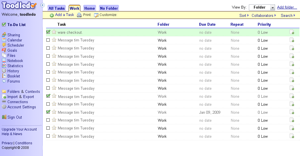
Sorry if this is the wrong forum for this sort of thing. I was feeling a bit overwhelmed by Toodledo's layout... It took about 3 minutes to find the "Add task" button, for example. I don't know when / if you guys might be planning a layout refresh, but just in case I mocked up an alternative layout, below.
|
|
frossie |
seishino - I agree that the Add A Task button isn't in the most obvious place, and your layout is better in that respect. But I have to say that if you spend any time with toodledo it is definitely worth to learn the keyboard shortcuts, after which you won't really care.
|
|
Jeremy |
I like the folder tabs at the top.
|
|
J-Mac |
First blush - I like it. I'd have to use it a bit to see if I really like it, but right now it looks pretty nice. Simpler is usually better IMO. ;)
Jim |
|
Jeremy |
Would be nice as an account setting...
|
|
garyo |
In case it's relevant, I'd like to see a *lot* more customizability of this type. For instance, I don't need to see "1 Medium Priority" spelled out every time; after I've used ToodleDo for a few hours I get the -1, 0, 1, 2, 3 thing. The number by itself would be fine. In fact far better would be color-coding by priority, or a little color bar in front of the line (like RTM). Saves space, is clearer, less clutter.
Also I thought "Toggle Dividers" would turn the dividers on & off (I'd like them off), but it doesn't; it toggles their contents! Is that useful? And is there a way to make nearby dates display as "Today", "Tomorrow" and "Yesterday"? In the main screen, repeat should show as a little icon that you can click on to see the repeats, not a whole column dedicated just to that! (Especially in multi-line the little icon would be useful, just like priority.) Could checking off a task strike-through its name? I'm sure there's a lot more, but these UI issues seem to be the main issue for me with ToodleDo. Otherwise it's very nice! I'm still getting used to it, setting up saved searches and so on. The Firefox sidebar is very good, but haven't tried syncing it to my Android phone yet. |
|
Jake Toodledo Founder |
Thanks for the suggestions.
|
|
Pythica |
I like having the Add a Task in the upper right hand corner. It never really moves its relative position on the screen--even when I slide the left-hand nav bar in and out--and this is an invaluable feature.
Please don't move it to another location. Then I will have to look for its new position on a sub-nav bar whenever I change a view. My eyes are too lazy for that. Toodledo's ease of adding new tasks is the first reason I switched from RTM. (RTM is miserable for adding new tasks. A pretty big flaw when you are a task management app.) After switching, I keep finding dozens of new reasons to love Toodledo. |
|
slamp |
I like toodledo features. I do not like the actual layout.
It will be great if we could create skins using css. For example, I like the folder tabs at the top. |
|
eph.zero |
I agree, especially about "toggle dividers." I, too, was expecting it to REMOVE the dividers.
Love the features, but the interface is too busy. I like the Vitalist interface, as an example of something that's similar but cleaner. |
|
roddyt |
Posted by garyo:
Also I thought "Toggle Dividers" would turn the dividers on & off (I'd like them off), but it doesn't; it toggles their contents! Is that useful? Posted by eph.zero: I agree, especially about "toggle dividers." I, too, was expecting it to REMOVE the dividers. Toggle dividers is very useful to me. I use folders for projects. When I want to review them, I go to the Main View-by screen and sort by Folders. Toggle dividers collapses the whole lot, then I click each folder in turn to open it and review that one project without the clutter of all the others. A side benefit is that it is a convenient way to see the full list of just about anything (folders, contexts, etc.). This can be helpful when you have so many items in the category that they don't all fit in the tab view across the top. Roddy |
|
eph.zero |
Yes, collapsing can be useful, but I would also like to see a separate "toggle dividers on/off" feature.
|
|
kelly |
i'd like to see "add multiple tasks" right under "add task", so i don't have to click twice to get there.
|
You cannot reply yet
U Back to topic home
R Post a reply
To participate in these forums, you must be signed in.