ForumsSearch
Search results for "Posted by vihendi"
| Author | Message |
|---|---|
|
vihendi |
I think some people here are looking for a dedicated button that by clicking on it advances the task to tomorrow.
This is practically the postpone-feature in RTM. However, it is initiated by a keystroke not a button. I know this is possible by installing a script that is offered in this forum. Greetings and the best for 2012! |
|
vihendi |
Thanks for the answer.
And sorry, but please allow: 1st Click: Open up Pop-Up-Calendar 2nd Click: Chose New Date. You confused me with your quote it would be a one click action - this was new to me, since at least I thought you meant right from the task list. |
|
vihendi |
Posted by Toodledo:
What do you mean "advancing the date"? Do you mean moving if forward by one day? That is a one-click action already. Ok, I jump on that train, too. I do not know how this is a one-click action, please explain. I see two clicks at the moment. |
|
vihendi |
Posted Dec 01, 2011 in: Toodledo Redesign - July 2011 - Part 3
Score: -1
Posted by Salgud:
@vihendi No, you can't sort tags alphabetically. It is often requested, and is on "the list". Does it help, when I remention topics that might have faded out of focus? Please sort tags alphabetically. At least in the Filter Dropdown and the Tag View of Tasks. It slows down my workflow. |
|
vihendi |
Hi,
I want to set up a general "saved search". This saved search should show me tasks "due by" within 7 days OR "due on" today. However, I cannot find a way to set up it this way that I will see e.g. the "due by" within 5 days, but NOT the "due on" in 5 days. Is this possible? Thanks for any help. |
|
vihendi |
Posted Aug 30, 2011 in: Toodledo Redesign - July 2011 - Part 3
Score: -1
I am reporting a personal Problem - I guess it is not a bug.
I have quite a few tags. When I want to filter for a set of tags, I see that they are sorted the same way they are when adding a tag - by the amount the specific tag is used. At least within the filter I have a very hard time finding what I am looking for. Can you sort the tag-items within a filter alphabetically? This would at least help me a lot. |
|
vihendi |
Although I am not the author of this script, might this help?
http://userscripts.org/scripts/show/108458 |
|
vihendi |
Posted Aug 11, 2011 in: [UserStyles] Minimalist style for new layout
Score: 0
@cliftonr
Love it! It's what I needed, also like the sorta half hiding of the sidebar ;) Thank you for sharing. |
|
vihendi |
Posted Aug 04, 2011 in: Incorrect Task Filtering: Indented Subtasks and Priority View
Score: 0
Scenario: I treat my subtasks as "Indented".
When I view my tasks by Priority and click for example on "High", I geht to see the Top-Level-Task (that is correct) with the indented Subtasks. However, also Subtasks with a Priority different to "High". I hope and guess that this is a bug ;) (and btw: thanks for the great Update today!) |
|
vihendi |
I use grid view. I have to admit it fits horizontally on my screen (and I work with a 14" notebook screen). However, I always try to use only the minimum number of columns.
I liked a comment made by a different user, however: Hiding the sidebar would even make him (and me) more productive. I want to concentrate on a list. And removing whatever type of clutter helps with that. So, I know there are people who have to scroll horizontally and for workflow reasons, too, I give this a +1. (there are so many people having this wish, I am pretty confident it won't be ignored) |
|
vihendi |
I tried to collect some points.
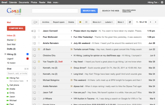
The new bar on top is absolutely great. I think it outplays (most of) the competition. However, some easy things can be made to make the usability experience a lot better/really good: 1. Everything is grey. Try to close your eyes halfway - so that you cannot read any text anymore. On good Websites due to coloring, font size etc the most important stuff sticks out from the rest. This should especially apply to a ToDo-List. However, everything is the same. Take a look at Google's new gmail interface: http://www.shoutmeloud.com/wp-content/uploads/2011/07/gmail-new-look-550x350.png I think it becomes obvious. While sender and topic sticks out, unimportant stuff turns barely visible. => So please make the icons (as Action) lighter and/or smaller. Also categories (folder, context, tags) could be lighter. Also, if you offer other colors/themes than grey it might help orientation. 2. Attacking the same problem: Please replace "none", "no date", "no context" with e.g. "-" in Grid format. I know that it is "no CONTEXT" if it is in the Context Column. 3. I cannot see properly that a task is done. Why not strike it through? Or make the color even lighter? 4. Hide the left sidebar. (right, this is not new) Would be sufficient to show it again with a specific keystroke. 5. And a personal Usability-fav would be if for the new (and great) Quick-Add box the e-mail commands would work. So a task with "!" would get medium priority. I hope, I was able to get my points across and you can consider them. Thanks & Greetings! This message was edited Jul 26, 2011. |
|
vihendi |
Posted Jul 26, 2011 in: Toodledo Redesign - July 2011
Score: 1
A BIG THANK YOU, that you quickly changed the notes Icon. This struck me right away (negatively)!
Other than that: Congratulations to the new Design. I read your article and understand your reasons. To have filters in search view is also a great plus. I will be back with a more thorough feedback after using it for a while. I hope some small changes can still be made. |
|
vihendi |
Posted Apr 26, 2011 in: How I use Toodledo - Your ideas for improvement?
Score: 0
I was about to post the same as fredatmontreal. Anybody?
@VandVisX: In my case, the list I work on is a saved search - composed by tasks that are due today, tomorrow and overdue and the tasks I have starred. This way I can add tasks with no due date (=someday) or tasks I just want to work on to my "today's list". I find the star very useful. |
|
vihendi |
I think it could be prettier, however, this is easy to solve with a Greasemonkey userstyle.
If there is an overhaul planned, one could think about implementing a true vertical and horizontal navigation that is independent from one another. Most userstyle-solutions show a dependent vertical bar. I click on tags, then vertically all my tags appear. It would increase functionality if I could e.g. chose my vertical bar, e.g. Priority or Context or Status, within preferences. So I could see e.g. Folders horizontally and at the same time filter for Status vertically within a Folder. (If someone suggested this before, this should have been just a +1 ;-) ) |
|
vihendi |
Posted Mar 29, 2011 in: Turn off processing special characters in e-mail syntax
Score: 0
I also support the solution suggest by piyush_soni or something similar like generally one has to indicate the start of the context, tag, folder section with "|"
This message was edited Mar 30, 2011. |