ForumsNewsToodledo Redesign Phase 1
Toodledo Redesign Phase 1
| Author | Message |
|---|---|
|
Jake Toodledo Founder |
Today we are releasing our new redesigned homepage. This is what you will see when you are signing into Toodledo, and what new users will see before they decide to create an account.
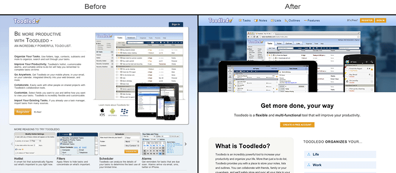 The new homepage was designed to have a more modern look and feel and to better communicate Toodledo's advantages to prospective customers. We have kept the signin button in the same location so it shouldn't be a disruption for existing users, but otherwise it has been totally changed. Since people new to Toodledo don't have any expectations of how the homepage is supposed to function, we felt that it was safe to replace everything in one fell swoop. When it comes to redesigning the internal parts of Toodledo we will be more conservative to avoid disrupting your productivity by making the site less familiar. Some of the key concepts that we were going for with the new home page were: Responsive This means that the page reformats itself appropriately regardless of the size of your screen. Don't you hate it when you go to a webpage on your phone and the text is too small to read and you have to pinch and zoom and scroll to see anything? That's what our old website was like. Tedious! Our new homepage looks just as good on a phone or tablet as it does on a full-sized monitor. This is how the web should work and is the direction that we are going with Toodledo. Eventually, you'll be able to use our entire website from a phone sized screen without a compromised experience. Equal Weight Sections Our old homepage only talked about Tasks; as far as new users knew, Toodledo was just a to-do list. But as you know, we are so much more than that now! Our new homepage gives equal weight to all four Toodledo sections: Tasks, Notes, Lists and Outlines and provides more information about how Toodledo functions as a complete productivity tool. More Information, Less Text Our old homepage had a lot to read, and a website typically only has a few seconds to capture the attention of a new users, so we decided to make our new homepage more visual. There is actually much more information about each Toodledo feature, but it's now on-demand, so when you click on a feature that interests you, an explanation will be provided at that time. We've also added several tutorial videos that explain how Toodledo works in a visual way, so users don't have to do a lot of reading if they don't want to. Refinements We have refined the colors, typography, buttons, icons, boxes and other elements of the site to make them cleaner and more cohesive. In the coming weeks and months you'll see these elements trickle down into the internal pages of Toodledo as we move onto the next phases of our site redesign. Hope you like it! This message was edited Sep 16, 2014. |
|
Purveyor |
Very impressive!
And it looks good on my iPhone. |
|
Dave |
Looks excellent on Chrome on my Galaxy S3 as well as on my Ipad 2 in Safari!
|
|
rbendett |
It looks great.
|
|
ram_ramakrishnan |
Any plans to also improve the design after you login? Maybe a modern interface using HTML5 with drag and drop features, offline support? That would be awesome.
|
|
maury.shapiro |
I have Windows 8. Could not get to the top right corner in order to log in. Only after hitting "forums" at the bottom of the page was I able to see this conversation and when I wanted to participate, that's when I got the chance to log in.
Help! |
| offsky - test | Post deleted |
|
Jake Toodledo Founder |
@maury.shapiro
Can you please create a support ticket or tell us why you were not able to get to the top right corner? |
|
Salgud |
Looks very good. It's encouraging to get an idea about what the working interface will be like.
|
|
dannyw0011 |
The new design made me do a double take when I signed in. Looks great!
|
|
bill_1367329013 |
Great Job - congratulations from a Happy Customer.
|
|
gbranham |
Looks good.
|
|
mooskagh |
I'm really glad that toodledo is being redesigned! Not that it bothered me too much, but the design clearly felt like it's from 1990s. Just peak any toodledo theme from userstyles.org -- and it would be a step into the future!
But the new start page still feels a bit like "1990s". Most probably it's because of that blue gradient on top, the rest is good. Please remove gradients! (There are cases when gradients are nice, but bad gradient is worse than no gradient) UPD: Sorry for being picky, but Toodledo logo is also from 1990s! Modern logos don't cast shadows and don't pretend to be 3D in other ways (compare old and new Google logo)! This message was edited Sep 19, 2014. |
|
Bridget K |
Hi there users! This is Bridget, the new visual and interactive designer at Toodledo.
I'd like to address the decision to stay with the current Toodledo visual brand in this homepage redesign. Posted by mooskagh: But the new start page still feels a bit like "1990s" You bring up a good point mooskagh. Other than minor tweaks the visual aesthetic of Toodledo's homepage has not yet radically changed and here's why. My goal is to create a consistent experience with the interface both before and after you are logged in. A user who's first impression of Toodledo is a sleek and modern interface on the homepage would be confused and potentially disappointed once logged in. When changes are made to the design elements they must be done so strategically so that the elements remain consistent across the system. i.e. If the logo changes on the homepage, it must change everywhere else it appears to create a cohesive brand identity So while there will be changes to the design in the coming future, they will be done so at a pace that allows us to keep everything consistent. Hope this helps, enjoy the weekend! :) BK |
|
mooskagh |
Posted by Bridget:
So while there will be changes to the design in the coming future... That's a good piece of news! Thanks. |
|
vivendom.budget |
Hi Bridget,
could you add the ability to hide/show the left side menu on lists as we can do on tasks environment right now ? Thank you ! This message was edited Sep 23, 2014. |
|
vivendom.budget |
Please Bridget,
you must do something with file uploading on tasks. It is so hard to find and upload and existing file to another task and we need 4 steps to upload files form the desktop. Please try to do it and you'll understand us. For me that is a priority Thanks ! This message was edited Sep 23, 2014. |
|
vivendom.budget |
Hi Bridget,
could you add counters for each outline ? I think that counters must show unchecked lines into the outline. It will be great Thanks! Joan This message was edited Sep 23, 2014. |
|
Alexander |
The new login screen won't let me fill out my credentials using 1Password anymore... Please fix! Thanks.
|
|
Jake Toodledo Founder |
I have 1Password and it was working for me. Can you please tell us what happens when you try to use iPassword?
|
You cannot reply yet
U Back to topic home
R Post a reply
To participate in these forums, you must be signed in.