ForumsNewsIntroducing the Breadcrumb Bar (part 1)
Introducing the Breadcrumb Bar (part 1)
| Author | Message |
|---|---|
|
Jake Toodledo Founder |
A few weeks ago we introduced the "Ribbon", which optimized the sidebar and provided a way to collapse it to maximize screen space for tasks. We also have plans to reorganize the Toolbar above your to-do list to make it cleaner and easier to use, but our vision for an improved Toolbar requires a number of things to be moved and redesigned. We thought that it would be too much change to do all at once, so we are now entering a brief transitional period. What you see today is not the final design. Over the next few weeks we will be slowly moving items around to maximize space for your tasks and clean up the toolbar area. We will announce and explain each of these changes in our forums. For our first explanation...
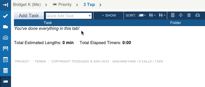 At the top of your to-do list you will now find a horizontal grey bar that we are calling the "Breadcrumb Bar". At a glance, this bar will show you which to-do list you are looking at and provide you with a quick way to navigate within the Task section. Just click on the list's name in the Breadcrumb Bar and a menu will appear to let you quickly change lists. This will make it possible to keep the sidebar collapsed more often, which will give you a wider and more focused view of your tasks. In additional, for those people who use our collaboration tools, the menu that allows you to switch workspaces has been relocated to the new Breadcrumb Bar. Just click your name, and you can quickly switch to a collaborator's list 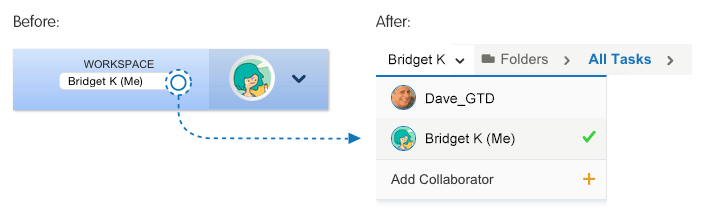 To make vertical space for the Breadcrumb Bar, we have gotten rid of the big "Footer Bar" at the bottom of the page and we have also compressed the task list ever so slightly (we stole 1 pixel of padding between each row). The net result is that even with the addition of the Breadcrumb Bar, more tasks can fit vertically on the screen than before, without feeling cramped. Our Beta testers have been playing with this for a few weeks and have helped us perfect it with their excellent feedback. Thanks! Do you have a suggestion or some constructive criticism? Please let us know in the forums or via a support ticket. This message was edited Sep 14, 2015. |
|
creek |
Haven't played with it much yet, but my initial feedback is Like, Like, Like. Loving all these UI improvements, made without falling victim to the "less is always more" trap.
|
|
tannen |
Awesome - this is a nice feature - and I'm looking forward to see what else you guys have up your sleeves! I usually work with the ribbon collapsed and at times it was slightly annoying that it would pop open when one of the icons was selected, so it's really nice to be able to move between sections using the breadcrumb bar while keeping the ribbon collapsed. Great job!
|
|
thepaj |
In 50 days my subscription will end and I must decide on extending or not. I hope there will still be some uncluttered space left on screen by then. I used to love the simple interface with few distractions. Just a lot of filter and sorting options on a fast and stable engine, allowing me to get things done. Even on small displays where every pixel counts.
I don't understand the need for both the ribbon (at all, really) and the breadcrumb bar, since they both do the same thing in terms of selecting views. And both requires more clicks to change the view than was needed before with the auto-collapsing side menu. Sorry I don't get it. If the ribbon must be used, why not try to put collaboration stuff in there too? Or get rid of the non-auto-collapsing ribbon and just use the breadcrumb bar? Sorry about my ranting, but I don't think Toodledo is improving as a productivity tool right now. |
|
pawelkaleta |
I really like this change, thanks and keep up good work!
|
|
Martys To Do |
Very nice.
Much easier to locate and identify the list. |
|
FHE-IV |
Suggestion: make the breadcrumb bar an option. If you remove the option for ability to see the number of tasks like one can on the left THAT would be a real loss. Personally I like number of tasks (for each category to display together) a lot because it is real look into my day week, month; all at a glance. I never have that in collapsed mode, but again it is a great option.
All in all, great product! |
|
Chris_45 |
I am using the beta site, and the ability for the ribbon to show and hide on mouseover seems to have disappeared. Has that functionality been removed, or is there an option to turn it back on?
For my two pence worth, I do think the breadcrumb bar somewhat duplicates the functionality of the ribbon, not quite sure why both are needed. But, I still like it! |
|
Ann M |
I just logged on this morning to find the changes and I thought oh that's great. Then I used it and saw the jump from folder to context within the same window. Now that is fantastic. You have improved the usability in a way I hadn't thought of and I so thrilled. I love, love, love, the task changes. That's where I live so please keep it coming. Much appreciation from a faithful customer. Ann
|
|
Christoph Dollis |
Posted by thepaj:
both requires more clicks to change the view than was needed before with the auto-collapsing side menu This much is true. The ribbon is nice. An autocollapsing ribbon is better, or just the breadcrumb bar.I'm loving Toodledo now that I've figured out how to configure it to work best for me, and I've just happily renewed my Gold Membership for another year. However, the autocollapse was nice. It's great to see nothing on the left except your tasks! This message was edited Sep 15, 2015. |
|
Bridget K |
Posted by Chris:
I am using the beta site, and the ability for the ribbon to show and hide on mouseover seems to have disappeared. Has that functionality been removed, or is there an option to turn it back on?! Hey Chris, Don't worry, the auto-collapse functionality still exists. In testing it we discovered a few technical and usability issues that we have not yet solved. We are continuing to improve and test this interaction before releasing it to production. |
|
Salgud |
I've been away for a while, and just visited TD for the first time in a couple of months. Wow, have things changed! Looks much better for sure. However,I'm not a fan of the breadcrumb bar. It's functionality is already covered by the dark blue bar on the left edge of the screen, as far as I can tell. I don't use collaboration so maybe that's why it's a miss for me, and I spend virtually all my time in the Saved Searches view, and prefer to have the view list exposed. At the very least, please make the breadcrumbs bar optional.
Thanks for all your efforts, Bridget. |
|
jeremiah.moss |
Question: What's the difference between the functionality of the bar on the left, and the breadcrumb bar on top? They just seem to be different ways of navigating?
|
|
Bridget K |
Posted by jeremiah.moss:
Question: What's the difference between the functionality of the bar on the left, and the breadcrumb bar on top? They just seem to be different ways of navigating? Both the ribbon and the breadcrumb bar are in a state of partial completeness. We are releasing changes incrementally in order to avoid overwhelming our current users with new features. Both of these items will have more functionality in the near future. Posted by Salgud: I've been away for a while, and just visited TD for the first time in a couple of months. Yes, it has been a while since we heard from you. Glad you're back. This message was edited Sep 15, 2015. |
|
Matt MacIntosh |
How can I hide this bread crumb bar? I can see how it would be helpful for some point, but I have no use for it... it just clutters me screen. Any way to get rid of it? Not to be a pain... it's a great innovation... but since I don't collaborate or use separate folders for tasks, it's a bit of a nuisance.
Thanks! =) |
|
coolexplorer |
The interactive ''breadcrumb bar'' with the drop-down menus is the single most productive element you have added to TD recently. It not only clearly tells me which view I am in, but also allows me to quickly change views to look at my tasks from various angles (without opening the side menu and shifting all my tasks to the right of the screen). Because of the drop-down menus convenience, I find I am doing much more analysis of my tasks, looking at them from various parameters, to make sure I am on track with my goals and priorities. In sum I am now more enthusiastic and productive in using Toodledo. Thanks Jake & Bridget!
I humbly disagree with the extreme view of some that "every pixel matters". If so, no change would ever be possible. IMO Jake & Bridget are making very judicious changes to TD after giving it a lot of thought and after putting it through the fire of user comments on the beta channel. If it all they are erring on the side of caution and conservatism. Thanks again. :) |
|
c5000nc |
I really like the bread crumb bar, but would suggest one minor enhancement:
At each stage from left to right, add a Refresh button between the item and the arrow. This would allow us to refresh with one click instead of two (clicking on the item, then again on that same item on the pull down menu). This currently is especially cumbersome if there are a lot of items on the pull down menu (like Folders), requiring us to also scroll to refresh it. I frequently change the date or other column of a To-Do, and like to refresh the view. It would be nice to have one click for that with the left side closed. Thanks. |
|
dannyw0011 |
While I think both the Ribbon and the Breadcrumb Bar are an improvement over the old design, I believe I prefer the Breadcrumb Bar. While not as polished graphically, I like the drill down to what I'm looking for. I believe it would be great to have an option of displaying and using either of them.
And welcome back, Salgud. You had been gone for so long, I thought you must had departed for the great beyond! |
|
boydston01 |
Very nice. The breadcrumb bar makes it so easy to see what view I am in. I have always had difficulty (not in a significant way, though) with the sidebar and, even now, with the ribbon. The breadcrumb bar is so much clearer. I still like the ribbon, though.
|
|
Christoph Dollis |
Posted by coolexplorer:
I humbly disagree with the extreme view of some that "every pixel matters". Every click matters. |
You cannot reply yet
U Back to topic home
R Post a reply
To participate in these forums, you must be signed in.