ForumsNewsBreadcrumb Bar Update (part 3)
Breadcrumb Bar Update (part 3)
| Author | Message |
|---|---|
|
Jake Toodledo Founder |
Today we are releasing part 3 of our multi-part transitional redesign (Part 1, Part 2).
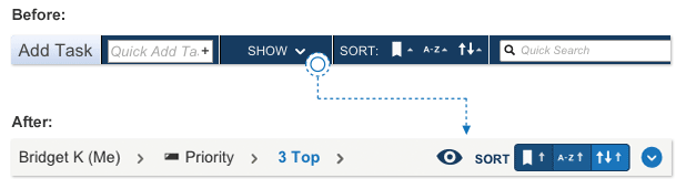 You will see that the old "Show" menu that manages your filters has been moved into the breadcrumb bar and been replaced with an "eye" icon. The "Sort" buttons have been moved into the breadcrumb bar as well. 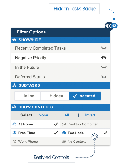 We have also taken the opportunity to redesign the pop-up menus that appear when you click on either of these items. These menus are now cleaner and easier to use. 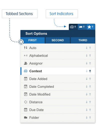 As you can see from this and our previous 2 stages of this redesign, we are progressively moving things out of the toolbar, with the eventual goal of getting rid of the toolbar entirely. There are two big reasons why we are doing this. First, to simplify the page and give more space and attention to your tasks, with fewer distractions. Second, to eventually allow the page to work at mobile phone sizes. We are doing this in small stages to prevent a major disruption to your productivity. We still have one or two more steps to go in this process. We have been testing this with our Beta Testers for about 2 weeks and have gotten a good response. Please let us know here or in a support ticket if you have any constructive feedback. This message was edited Oct 20, 2015. |
|
Purveyor |
Very nicely done. :-)
The icons are informative and the layout is clean. Now there's a lot of room to expand the "Quick Add Task" box, or will you be getting rid of the dark blue band and put the Add and Search functions elsewhere? |
|
ChristianDiscer |
Keep up the excellent progress!
However, the icons used with the "show/hide" area, that is the open eye/closed eye, seem inconsistent with the other parts of the dialog. To me they should be checkmark / no checkmark - that is blank. BTW I can't help but see a cow's udder when looking at the closed eye - sorry! :) |
|
c5000nc |
It looks great but I hope this means full Search capability is coming to the Breadcrumb Bar so we don't have to open the left side and close it to do a full Search AND see the right side scroll bar.
Thanks! |
|
Hugh O'Donnell |
I am really tickled with the redisign, especially since I'm learning not to confuse contexts with folders and folders with tags! Toodledo rocks!
My advice to someone like me (basic Gold User, somewhat GTD oriented, and a little dense) who really wants to use this app is to watch all the cool instructional videos as many times as you need to understand each feature. Then ask questions on the forum. I just reconfigured my whole list of stuff (a mere 47 items) taking advantage of contexts and tags, and not only do I get it, but my mind is even more at ease since my tasks are so... sortable. A side benefit of getting rid of a lot of folders and turning them into contexts and tags was that my "Notes" section sidebar cleared up considerably. I am so glad I stuck with this program! |
|
Christoph Dollis |
The placement is good, the idea is good, the only thing is, maybe, the sort icons stand out a bit overmuch. Perhaps their color scheme should be reversed to fit in with the breadcrumb bar.
I.e., dark icons with a transparent background, vs. light icons with a dark blue background. |
|
Christoph Dollis |
Actually, no. More.
Show task details should be brought under the eye icon, along with close/open dividers. (Although if the show task details had its own icon, that would be even better, in my opinion, but I understand if you're trying to reduce the size taken up in order to make this mobile friendly). Grid and multiline view could replace the current dropdown icon at the far right. It could be a single icon which changes depending on state. So, if in grid view, the multiline icon shows; or, if multiline view, the grid icon shows. That way no additional real estate is required. |
|
Christoph Dollis |
Speaking of icons, under the Eye icon on the Calendar view, there are checkmarks beside Starting,In Progress, etc., in that submenu. If you're going with the eye open/close icons under that submenu for Negative Tasks, Future Tasks, etc., you may want to keep that consistent.
Just a tiny design point, but it makes sense to me. This message was edited Oct 06, 2015. |
|
Salgud |
Posted by Christoph Dollis:
Actually, no. More. Show task details should be brought under the eye icon, along with close/open dividers. It seems to me that show/hide task details close/open dividers are not filters, as are the selections under the eye icon, and should be kept separate. They affect the format of the view, but don't filter or show subsets of tasks. |
|
c5000nc |
Posted by Salgud:
Posted by Christoph Dollis: \Actually, no. More. Show task details should be brought under the eye icon, along with close/open dividers. It seems to me that show/hide task details close/open dividers are not filters, as are the selections under the eye icon, and should be kept separate. They affect the format of the view, but don't filter or show subsets of tasks. I agree. Sort, Show Contexts, Show Tags, etc., just re-arrange or re-display the Tasks that are already displayed. Conversely, the Show/Hide function (though not very robust with only 3 things to show/hide), like the robust New Search, changes the Tasks you see displayed. It would seem to make more sense to combine Show/Hide with the robust New Search function, both on the right side of the Breadcrumb Bar. |
|
Wayne T. |
The sort options are a little confusing. The type of sort selected is highlighted in blue for the current selection, but the normal/reverse option is highlighted in black for the current selection.
|
|
boydston01 |
Posted by Jake:
Second, to eventually allow the page to work at mobile phone sizes. Is this going to be full responsive design?! Or just two different size formats? Everything is coming along very nice! This message was edited Oct 07, 2015. |
|
coolexplorer |
Overall great design changes :
1. The opened eye - closed eye looks good (perhaps add two more eyelashes to avoid the "cows udder similarity" mentioned by some users. 2. Love the fact that the eye has a Badge indicating the number of tasks hidden due to filters. 3. The Context and Tags text in grey are a bit hard to read for older aged users. Could it be in black instead of grey, and then turn entirely blue on clicking? 4. Under the Actions caret icon : (a) The "Tasks Note details" could be better represented by the same note icons used in the spreadsheet (i.e. grayed out hollow note and black filled note). (b) The "Dividers" could be better represented by the earlier icons showing open and closed bars. 5. Representation of Ascending or Descending order in Sort filters is excellent. |
|
ukz_ |
Have only just spotted the new feature.
I do like the feel of the filter options now. Everything worked before of course but the new design feels "right" somehow. Excellent. |
|
boydston01 |
Posted by coolexplorer:
1. The opened eye - closed eye looks good (perhaps add two more eyelashes to avoid the "cows udder similarity" mentioned by some users. I kind of like that you can imagine it as a cow's udder! It's funny! |
|
c5000nc |
Posted by c5000nc:
It looks great but I hope this means full Search capability is coming to the Breadcrumb Bar so we don't have to open the left side and close it to do a full Search AND see the right side scroll bar. Thanks! Thanks Jake, for adding the New Search button at the top of Search in the Breadcrumb Bar!!! Maybe it was there all along and I didn't notice. |
|
SES21 |
Posted by c5000nc:
Posted by c5000nc: It looks great but I hope this means full Search capability is coming to the Breadcrumb Bar so we don't have to open the left side and close it to do a full Search AND see the right side scroll bar. Thanks! Thanks Jake, for adding the New Search button at the top of Search in the Breadcrumb Bar!!! Maybe it was there all along and I didn't notice. Maybe I'm just being thick-headed but what are you talking about that's different? |
|
endofdays_old |
Loving the updates and enjoying the journey!
I am reminded of one request which I made before to have a dedicated button to invert between two sets of Contexts. My use case is that I have one set of Contexts for work related activities and one set for personal related activities. This is in addition to using Folders to distinguish between different Work and Personal Projects using Folders. In work I have the Work set of Contexts selected in the web app running in a browser on my work PC so I can stay focused on work related tasks. When I get home after work, I use the web app on my home MAC to switch to the Home set of Contexts which means opening the new dropdown/popup dialog and finding the Invert text and clicking on it. Usable but ... in an ideal world I'd rather have one button on the Breadcrumb bar or on the top of page toolbar (on the RHS where the Add Task was temporarily). A compromise might be a machine specific Context selection which would obviate the need for the Invert action twice (or more) a day. So my work related PC browser would show one set of Contexts while my home MAC browser would show the inverse set of Contexts. Does anyone have an alternative ultra low resistance suggestion given that I am an old dog very set in the way(s) I use Toodledo? Thanks for reading :) |
You cannot reply yet
U Back to topic home
R Post a reply
To participate in these forums, you must be signed in.