ForumsNewsThe New Tasks Section
The New Tasks Section
| Author | Message |
|---|---|
|
Jake Toodledo Founder |
Toodledo has been helping people organize their tasks for over 12 years. Much of the original programming for the Tasks section is still in use, which is good, because it shows that the Tasks section is robust and well tested. However, technology has changed in 12 years and it was becoming more and more difficult to add new modern functionality to this old code. So, about a year ago, we started rewriting the Tasks section of Toodledo using the latest technology.
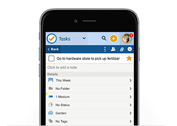
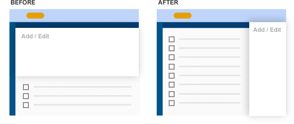
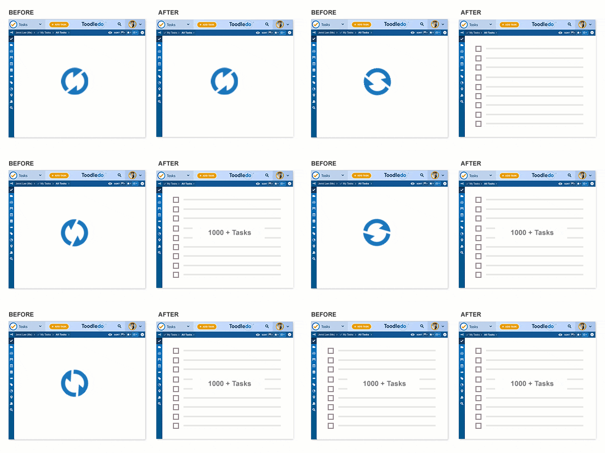
We've been "done" for several months and have been extensively testing the new Tasks section with our Beta Testers. They have helped us fix a lot of bugs. A few weeks ago, we opened up the new section for anyone to preview and we've gotten a lot of good feedback. Thanks! The bug reports have trickled down to almost nothing, so its time for a more official release. We won't be replacing the Tasks section just yet, we want to take it slow so we don't disrupt anyone's workflow. Right now, everyone will still be seeing the old Tasks section when they come to Toodledo. If you look in the bottom right corner, you'll see a blue tab with an exclamation point on it. If you open this, you'll have the opportunity to start using the new Tasks section. Here is the new URL: https://tasks.toodledo.com You can bookmark this new URL if you want to go straight to the new section all the time. We'll make the new Tasks section the default destination for everyone at some point in the future. We didn't want to make people less productive, so we took care to keep everything familiar and to keep the functionality pretty much the same as before. That said, we did take the opportunity to make some changes where we thought we could make a big improvement. Here is a list of the major differences, with our explanation for why we made these changes. Mobile Friendly Layout  The new Tasks section is completely functional at any screen size. You can view this page on your desktop, your tablet or your phone and it will automatically scale to the size of your screen and work perfectly. You no longer need to use our special (reduced functionality) mobile website and for many people you won't even need to use a dedicated app to access Toodledo from your phone. The Toodledo website in your phone's web browser should work great, and in some cases may have improved functionality! Tray  The 'Add Task' and 'Batch Edit' drawers have been moved into a tray on the right side of the screen. This allows you to more easily reference your to-do list as you add or edit tasks. This is an important improvement for tablet and laptop screens, where adding a new task used to take up a majority of the screen. Now you can easily scroll through your list and reference other tasks as you add new tasks. We have also moved the "Add Task" button to the right side of the screen to minimize mouse movement between clicking the button and then entering the details of the new task. You can use keyboard shortcuts to do all of this as well, so mouse movement is not required. This change also made the experience consistent across desktop and mobile browsers, so regardless of what screen you are using, everything will be in the same place and work in the same way. Subtasks  We're using new icons to better indicate subtasks and subtask groups, and we have also made it easier to distinguish between a task and a subtasks by moving the checkbox for subtasks inside the group. This allows the icons on the left side to maintain their vertical alignment which makes the page cleaner and easier to use. Performance  We put a lot of emphasis on speed with this update. Previously, loading a long list of tasks could have taken 10 seconds or more due to the old technology. Now, a list of any size will load very quickly. If you have over 500 tasks, you'll notice the speed improvement right away. We have also made many other common actions faster. For example, editing the priority of a task used to take 3 clicks, now it takes 2. Things that use to be prohibitively slow are now possible. For example, you can now see "badges" in the Saved Search section to show the number of tasks inside each Saved Search, and when you add or edit a task, the badges and list counts update in real time, you don't need to refresh the page anymore. Saved Search Creating or editing a saved search has moved to the sidebar. We did this for two reasons. First, it allows the behavior to be consistent across mobile and desktop screens. Second, for desktop users, it allows you to view the matching tasks while you continue to edit and refine your search. This makes it much easier to fine tune a search. This was much more cumbersome before. Calendar The Calendar view has been merged with the Dates view to put all of the date related lists in the same place. In addition, the calendar has been entirely re-engineered. Now, you can select any range of dates that you want, and it will show you the tasks that fall within that range. The old calendar couldn't do this. Offline Mode Already, the new Tasks section has some offline capabilities. If you are using the new website and your internet connection goes away, you can still keep using Toodledo. As long as you don't close the window, you'll be fine. When the internet comes back, all the changes you made while offline will sync up with the server. We are already working to improve this so that you don't have to keep the page open while offline. We are very excited about this new Tasks section and we hope you are too. Please let us know if you have any feedback. This message was edited Mar 07, 2017. |
|
akorvemaker |
Changes don't seem to be really synchronizing between the old and new interfaces.
If I add an event in the NEW interface and refresh the OLD interface (by pressing F5), it appears. If I add an event in the OLD interface and refresh the NEW interface, it doesn't. Checking off an event in the OLD interface still leaves it in the NEW. Checking it off in NEW removes it properly from OLD. (I think that's accurate to what I'm experiencing.) |
|
Jake Toodledo Founder |
If you have the old and the new interfaces open in the same browser at the same time, it might get confused. If you are using the new interface and you make a change somewhere else (like on the old interface in another window, or in an app, or on another computer), then it will take up to 5 minutes for the new interface to sync and get those changes, but if you reload the page it should get it immediately.
|
|
akorvemaker |
Refreshing (pressing F5, Chrome on Win10) still doesn't seem to make it show up in NEW. Refreshing does seem to fix things that weren't appearing in the OLD interface, but not NEW.
And yes, both old and new interfaces are open in the same browser. That's probably contributing to the confusion. And I forgot to add: Fantastic work. It looks great! Andy |
|
bpimentel+toodledo |
I like the little "recurring" icon that appears within the check box for recurring tasks, but it also makes it harder to tell at a glance what's completed and what isn't. My preference would be for more visual contrast there, or maybe move the icon elsewhere?
Thanks for the nice update! |
|
BobGott |
I like the new look & feel. It is refreshing and better iconic feedback.
Was hoping for better formatting in the notes section. |
|
coolexplorer |
Posted by bpimentel+toodledo:
I like the little "recurring" icon that appears within the check box for recurring tasks, but it also makes it harder to tell at a glance what's completed and what isn't. My preference would be for more visual contrast there, or maybe move the icon elsewhere? Thanks for the nice update! Try going to Settings and selecting option of striking out completed tasks, to give a better visual feel of completion. May help, or not. |
|
tannen |
So far it looks fantastic - much cleaner and easier to work with.
One thing that's confusing is how date range selection in the new Calendar view is supposed to work. If I click on Due Today, Due Tomorrow, or Any Due-Date in the top left pane I see the tasks that I should see in the right hand pane. The problem I'm having is trying to use the circular date selector in the lower left pane. If I click on a date, move the mouse to another date, then click again so the date range is highlighted in blue I'm finding that there are no tasks showing in the right hand pane. Same problem just clicking on a single date to highlight just that one day - I still don't see tasks in the right hand pane. Am I missing something or is the Calendar view not working? Thanks. |
|
mattybingham |
I really love the new interface; well done! My only piece of feedback is that the calendar doesn't really seem to be working for me. I drag along the range of dates from today until Saturday, knowing I have things due this week, and I'm getting zero hits. Am I missing something?
|
|
Jake Toodledo Founder |
If the calendar isn't showing anything its probably because the filters have it set to not show anything. Click the "eye" icon and then in the calendar filter, click the things you want it to show.
|
|
RvP_2 |
I love Toodledo very much and I use it intensively, but the weakest element of the Toodledo-system in my opinion is that it has still not any textediting options in the note-section of the tasklist. I hope so much Toodledo wil introduce this soon! Do you have any plans to do so?
|
|
mattybingham |
Jake, thanks so much! This totally fixed it. I really do love the new interface. So much cleaner.
|
|
coolexplorer |
Looking forward to the new TD website having more and more OFFLINE support, as my internet is often flaky.
Appreciate all the changes made in TD, kindly keep improving the Task section of the service. |
|
tannen |
Thanks for that information, Jake. I couldn't select any of the options, so I went to Chrome to test. I clicked on the "eyeball", selected "@Due", and it worked fine. I went back to Firefox (64 bit, version 52), which is my primary browser, and I found that I couldn't select any of the "@" options. Looks like the problem is in Firefox. :-(
Posted by Jake: If the calendar isn't showing anything its probably because the filters have it set to not show anything. Click the "eye" icon and then in the calendar filter, click the things you want it to show.
|
|
Jake Toodledo Founder |
Yes, I can confirm that Firefox can't do the calendar filters. I'll get this fixed. Sorry.
|
|
tannen |
No worries - and thank you!
Posted by Jake: Yes, I can confirm that Firefox can't do the calendar filters. I'll get this fixed. Sorry.
|
|
dmos01 |
Love the changes, recurring symbol in the checkbox and speed improvements!
One problem I have, though, is that when I open the Start or Due date calendar pickers the yellow highlight is one day before the respectively selected date. I presume this is a timezone problem (I'm in New Zealand). (The today/tomorrow text in the task list does show correctly, though.) Edit: On some more investigation the problem seems to be about the change between Daylight Saving Time and Standard Time. The yellow highlight shows correctly on Standard Time dates and incorrectly on Daylight Saving Time dates. (Daylight Saving begins on the last Sunday in September and ends on the first Sunday in April.) This message was edited Mar 07, 2017. |
|
dandrei |
saved searches don't have the same numbering.
|
|
dandrei |
My saved searches don't work anymore. They show empty lists. I'll quickly move back to the previous setup.
|
|
leone8_1333202367 |
I have problems with calendar too: before I simply clicked on the day I wanted to see, and I got all the tasks for that day.
Now I had to click 2 times on the day I'm interested, and I see anything. My browser is Chrome. Can you help me please? Thanks |
You cannot reply yet
U Back to topic home
R Post a reply
To participate in these forums, you must be signed in.
