ForumsQuestionsNew interface comments
New interface comments
| Author | Message |
|---|---|
|
WT Sherman |
Call me crazy, but I actually liked the older interface a little better. It was simple to use and clean in my view. I will get used to the new UI. A few things that concern me with the new UI are:
- Printing tasks with Internet Explorer (which I am forced to use at work) sometimes prints a blank first page. - My saved searches used to tell me how many tasks were queried. - I agree with the others about not caring for the wider view (it almost requires I have leave my browser in full-screen). This message was edited Jul 26, 2011. |
|
WT Sherman |
Also, the folder, due date, priority, and main counts do not update unless you do a full browser refresh. Just clicking the tabs do not updaate the counts.
|
|
Kevin |
I totally AGREE.....I really dislike this new interface!!!!
|
|
vihendi |
I tried to collect some points.
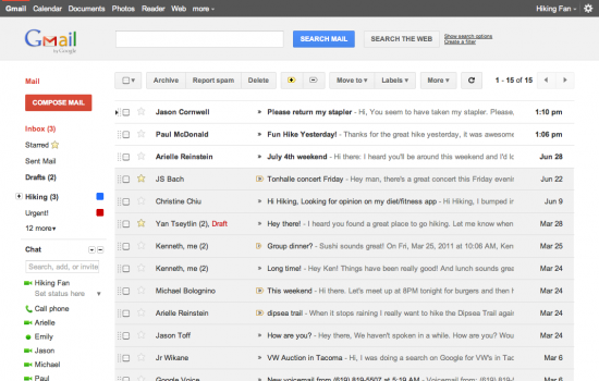
The new bar on top is absolutely great. I think it outplays (most of) the competition. However, some easy things can be made to make the usability experience a lot better/really good: 1. Everything is grey. Try to close your eyes halfway - so that you cannot read any text anymore. On good Websites due to coloring, font size etc the most important stuff sticks out from the rest. This should especially apply to a ToDo-List. However, everything is the same. Take a look at Google's new gmail interface: http://www.shoutmeloud.com/wp-content/uploads/2011/07/gmail-new-look-550x350.png I think it becomes obvious. While sender and topic sticks out, unimportant stuff turns barely visible. => So please make the icons (as Action) lighter and/or smaller. Also categories (folder, context, tags) could be lighter. Also, if you offer other colors/themes than grey it might help orientation. 2. Attacking the same problem: Please replace "none", "no date", "no context" with e.g. "-" in Grid format. I know that it is "no CONTEXT" if it is in the Context Column. 3. I cannot see properly that a task is done. Why not strike it through? Or make the color even lighter? 4. Hide the left sidebar. (right, this is not new) Would be sufficient to show it again with a specific keystroke. 5. And a personal Usability-fav would be if for the new (and great) Quick-Add box the e-mail commands would work. So a task with "!" would get medium priority. I hope, I was able to get my points across and you can consider them. Thanks & Greetings! This message was edited Jul 26, 2011. |
|
ronmoore73 |
I like minimalist programs and interfaces so I like the new interface. People complained about the old look of Toodledo and now many people are complaining about the new look.
|
|
Jake Toodledo Founder |
Thanks for the feedback. I have too much right now to individually respond, but we are taking everything in and will use it to direct improvements in the coming weeks. The response has been overwhelmingly positive. There are bound to be some people who dislike the new design. It is impossible to please everyone, but we are happy that the vast majority of people seem to be pleased.
|
|
v.kidwell |
I am having some problem with the note every time I try to go update it it create extra space between each line which it then saves with extra space. Please fix asap!
|
|
Jake Toodledo Founder |
We are working on this one. It appears to be an IE 9 issue only. We haven't been able to replicate it yet, but several people have reported it, so we are investigating.
|
|
nat.kuhn |
On the whole, I think the new interface is positive. Obviously it will take some getting used to. But a possible deal-breaker for me is loss of color-coding based on on task priority. This helped to bring visual attention to exactly where it was needed. Hope you will put this high on your own to-do list.
|
|
dcroissant |
I like the new interface - I would say drop the footer (wasted real estate) and move the links to the header.
|
|
Richard_ |
Just saw the new Interface: I like it, it looks far more "clean"
There are certainly a few rough edges but definitely it is nice. |
You cannot reply yet
U Back to topic home
R Post a reply
To participate in these forums, you must be signed in.