Toodledo Redesign - July 2011
Today we are revealing our third major redesign in our five years of existence. We hired our friends at ZURB to help make it possible, and we think that it looks really good.
A lot has changed
The changes may take a little getting used to. We have thought very hard about each aspect of the new design, and we are confident that Toodledo is now more efficient and more intuitive than it was before, which is what you want from a productivity tool.
We had three criteria that we kept in mind when redesigning Toodledo.com.
1. Improve the look and feel and bring Toodledo into the modern era with a professional design that didn't look like it was made by engineers (I'm an engineer, so I can say that).
2. Streamline the user interface to reduce clutter and complexity.
3. Avoid increasing the "cost" of commonly used actions. We are defining the word "cost" to mean the amount of time or number of clicks that it takes to perform an action. For example, completing a task has a cost of "1 click" on the checkbox.
If you consider it for a minute, you'll realize that #2 and #3 are at odds with each other. Reducing clutter and complexity will probably entail hiding some features that were previously exposed, which will increase the cost of those actions. We carefully weighed each element of our website and only made cost compromises when it was backed up by statistics or by making other improvements possible.
We realize that you have spent a lot of time getting familiar with the way Toodledo works, and that this redesign may make you slower while you re-learn your work patterns. Please give yourself some time to become accustomed to the new workflow. We believe that with a little reacquaintance time, you will be more efficient and productive. We know that there will be a small percentage of people who dislike our new design. This is inevitable, but we are hoping that two things will help minimize the number of people in this group.
Why the change?
1. Our old design was really bad. [see screenshot above] The new design is such a huge leap forwards, that I hope people will appreciate it more than if we were just "rearranging the furniture" for the novelty of it.
2) Later in this post, I am going to go point-by-point and explain each of our design decisions. My hope is to make it clear that we did not make any change without thoroughly thinking it through with good data to back it up. If you feel like actions are slower than before, please read the section at the end of this post to see why we did certain things.
People have been asking for a modern design for years, and we are very happy to finally have something to show for it. This redesign primarily focused on the home page, navigation, toolbars and notebook section. There is still more work to do over the coming months to improve the design of secondary pages, and to the display and management of individual tasks. So we aren't completely done, but we are well on our way.
Thanks, Jake
PS. If you are not interested in a point-by-point explanation of our design decisions, you can stop reading here.
Changes Explained
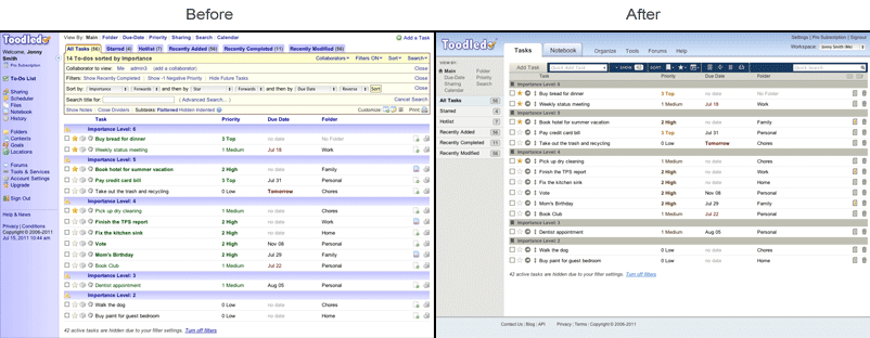
Sidebar - The side menu has been moved to the top and greatly simplified. It now takes up less room on the screen than before. The Notebook section has been given equal weight with the Tasks section, which it deserves. Some of the links [Sharing, Scheduler, Tools & Services] have been moved into a new "Tools" menu. This increases their cost by 1 click. This was a compromise, but these sections were not accessed very frequently so we felt that it was justified. Also, we have brought up several popular links [Statistics, Alarms, Mobile, Import/Export, 3rd party tools] that were previously buried two levels down, so their cost has decreased by 2 clicks each. The net result is a cost savings, which we feel good about. Several of the other links [Folders, Contexts, Goals, Locations, Files] were moved into an "Organize" menu. This increases their cost by 1 click, but we feel that this is ok. When we looked at the statistics, we noticed that the vast majority of people setup their folders, contexts, etc at the beginning and then rarely change them. The most common change is to add a new one, which is now much easier with the quick-add box that is available on the folder, context, goal and location pages. The other links have been repositioned, but their cost remains the same.
Views - Switching views [Main, Folders, Tags, etc] used to cause the entire page to refresh, which would take several seconds depending on your network connection and number of tasks in your list. Switching views is now done via Ajax, which is a fancy way to say that the page will not completely reload. The result is that switching views is much faster than before, saving you several seconds each time you do it. This may not be very noticeable, but these seconds add up. This single change will probably save you the most time over the course of a year.
Tabs - The tabs have been moved from the top of the page to the side. Their cost remains the same. The main reason for doing this was to allow people to have more than 6-8 tabs visible at a time. The way it previously worked, it would fit as many tabs as it could across the top and then all the others would end up in a hidden "More" menu. This was inconvenient for people with more than 6-8 tabs. Our statistics showed that more than 80% of you have at least one view that has more than 8 tabs. This change may take the most getting used to, but we feel that it is a positive improvement. As a side note, this more closely resembles the placement of tabs on our iPhone/iPad App, which more than 50% of you use, so this will make using both version of Toodledo more familiar.
Add Task button - The "Add Task" button has always been inconveniently placed in the upper right corner of the screen. Since adding a task is the single most used function on Toodledo, we decided to move the "Add Task" button to a prominent position on the left side of the new toolbar, immediately above the to-do list. In addition, we have added a new "Quick Add" text entry box. The new "Quick Add" feature is a convenient way to quickly add a series of tasks. Just type into the box and press return. The task will be instantly added, and the box will be cleared and ready to type another task. These two changes will make task creation much easier and quicker than before.
Filters - The various filters [completed, future, negative, deferred, subtasks, contexts, tags] have been cleaned up and put into a new unified toolbar button that has been renamed "Show #" with a number that indicates how may tasks have been filtered out. For the completed, future, negative and deferred filters, the old cost was 1-2 clicks depending on your settings. The new cost is 2 clicks. For the subtasks filter, the old cost was 1 click. The new cost is 2 clicks. For the context and tag filters, the old cost was 2-3 clicks. The new cost is 2 clicks. For the most part, the cost of this reorganization is neutral, but in some situations it might be 1 extra click. This was the biggest compromise that we had to make in the name of de-cluttering. The filters are now more visible and better organized, with a bigger target on the screen, so even through it may take an extra click, we think that it will be perceptually faster. We also noticed in our statistics that most people do not change their filters that often. As a bonus, filters are now available when doing a search, which wasn't possible before.
Sorting - Sorting by clicking the column headers has remained the same. The improvement here is that it will no longer lose your second and third sort criteria when you switch the first criteria. This will save people time resetting their sort settings to a previously used configuration. The sort toolbar has been moved into an always visible iconified sort menu in the toolbar. The old method for changing the sort via the toolbar cost 3-4 clicks. The new method costs 2 clicks, so this is clearly an improvement.
Quick Search - Quick search is now always visible (it used to be hidden in an optional toolbar). Depending on your previous settings, the cost is either the same or 1 click faster.
Other - The other toolbar functions have been repositioned, but their cost and functionality have remained the same.
Another important thing to note is that there is now more space on the screen for tasks. There is up to 100 vertical pixels of savings that can now be devoted to your task list, which is the most important part of Toodledo.
Calendar - The calendar section has long been a sore sport for Toodledo, so it has received a total makeover. Before, you couldn't sort, filter, search or share tasks on the calendar view. You also couldn't view tasks by week or by month, and you couldn't view tasks by start-date, only due-date. This has all changed. The Calendar view now shows a heads-up mini two month display. Each day will show the number of tasks for that day (same as before), except now start-date is taken into account in addition to due-date. You can sort, filter and search through tasks just like you can on the regular views, and you can also now select the entire month, or an entire week.
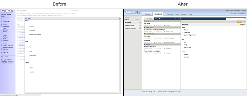
Notebook - The notebook section has also received a long overdue redesign. We borrowed elements from the task section to make the Notebook section feel more familiar. There is now a common toolbar that is used for adding, sorting and searching through notebook entries. You can now select notebooks by folder and by recently added or modified. You can now collapse and expand dividers and sort by any criteria in either direction. Printing has also been improved.
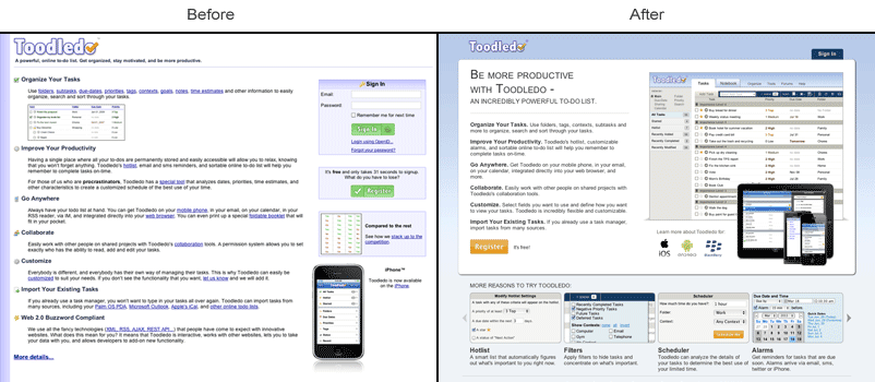
Homepage - We also took the opportunity to redesign the home page that you see when you visit Toodledo when you are signed out. This new landing page does a better job of advertising the key features of Toodledo in a visual way.
Site-wide - We have taken the new style and incorporated it throughout the rest of the website, including the forums, help section and tools. Nothing major, but it will be nice on the eyes.
Speed - As if that wasn't enough, we took the opportunity to aggressively optimize the website for speed. We now use a variety of advanced techniques to help make the website load and function faster than before.
I hope that this has explained why we made the changes that we did, and hopefully the bulk of you will agree with our decisions. If you disagree, please give us some constructive feedback in these forums or via a support ticket. We are still making tweaks and improvements and will listen to all comments that we receive.
Thanks,
Jake