ForumsNewsToodledo for iOS downgraded
Toodledo for iOS downgraded
| Author | Message |
|---|---|
|
gpbell |
Well, I liked the new UI (and reflected that in my app rating!). My only gripe was that the colours of the different priorities were very difficult to distinguish between. Toodledo provide a fantastic service for the price, and I am very grateful for the work they do! Looking forward to the new app, hopefully it will capture the best of the old and the new UI. Then maybe there will be time for Toodledo to develop a native app for Mac OS X? Please?!!
|
|
Jake Toodledo Founder |
Here are some before and after shots of the redesign and the new redesign.
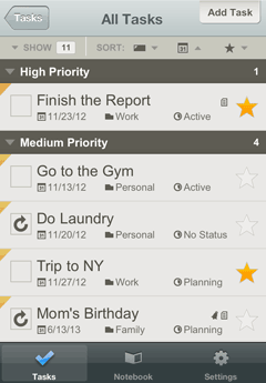 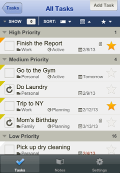 As you can see, we add back in some color, increased the contrast, tweaked the font sizes and got more information to fit on the screen. We are just putting the finishing touches on it right now and double testing everything. It should be ready to submit to Apple very soon. This message was edited Feb 09, 2013. |
|
gmcdaniels |
The above falls short of my expectations with regards to more color and visual differentiation. And I fear that could be a common reaction. Changing the the color of the header to blue doesn't really accomplish increased "contrast." I don't see much difference at all between the fonts. Varying hues of the same orange/yellow for priorities is not distinct enough, use different colors. I really hope this is not what you ultimately decide go with.
I'd rather say this here in the forums where it belongs and not in those stupid reviews. G This message was edited Feb 10, 2013. |
|
Jimbobal |
Love it - sorry to disagree with the last writer but I never thought the last version was bad and it was minor cosmetic touches that needed doing. This seem to have done that so ticks all my boxes. As long as the sync is a strong as it has always been and the support as good then great.
|
|
gmcdaniels |
To clarify. I like the new layout. Version 3.0 is/was excellent.
My point is that I don't see why it was necessary to downgrade us. There were quite few users lucky enough to catch this before they did the update to the old interface, all of whom have continued to use Version 3.0 with NO issues. To be honest, and sorry to disagree with Mr Garner, the difference above is very subtle, too subtle in terms of "Visual User Experience" and HIG protocol standards. With that said, I actually prefer the original version 3.0 on the left. As someone who always DID LIKE the original new UI overhaul and unfortunately did not pay attention and got downgraded, I did expect more than what I see above, given all the uproar and the new version being pulled. |
|
alexandremrj_2 |
Hello,
I like the new redesign. The left side picture is too muted to be readable, specially on low light settings, but the blue and the fonts a bit more charged really make a difference. For me looks like a go. PS: If you need beta testers for the iphone just let me know |
|
Joyce |
It is brighter and easier to read, The orange tabs in the corner are still a little indistinct and hard to see the difference between tho colors or why they might be there.
|
|
Jrodwin |
I am glad I figured out how to keep version 3.0 on my iPhone and iPad. I liked the version right from the start, and I like it better the more I use it. The new redesign is also nice. It is hard to say from looking at the pictures, but I expect that if I work with it for a while I will appreciate the new color contrast, even if the changes are subtle. Thanks for all the effort on this!
|
|
Matt |
I'm sorry to say that the latest design doesn't look worth the effort, it's not enough of a change for my liking. Unfortunately I didn't see the Vers 3 so can't comment on that one but I do think that the app & the web site need a fairly radical change to the UI. Functionally, both are good, but there is a lot that could be done to improve the inputs and also make viewing them less of a strain.
I have used the web in both 'lite & pro' modes, but input lags way behind others of this ilk. I don't use the app at the moment as i just can't get on with the UI. I prefer the 2Do app, which I then sync with the web site. I would rather use Toodledo on both though. I shall wait to see what changes the team come up with & if the interface is significantly improved I will gadlly reinstall the app. I would also like to see which projects each task is associated with much more easily than present. Again, look at 2Do and they colour code your projects making it much easier to see at a glance. This message was edited Feb 12, 2013. |
|
irek |
I really appreciate Toodledo for its flexibility and completeness.
Unfortunately I miss there more and more to me very important aspects: - Nice modern interface – take a look at Wunderlist to see what I mean. - Uncluttered interface – which allows me to concentrate on what I have to do, and not being continuously distracted by tens of controls and small pieces of information placed all around. I hoped that with new version you will learn from the competitors. The new trend is namely simplicity. If it could be combined with a strong engine in the background, like you have, you would get a really perfect combination! Unfortunately the new app represents a move in a backward direction: - I am sorry by the new UI is extremely ugly – dirty and grayish color combinations – I don’t like it all. Brrr! - Even much more cluttered interface. More tiny controls and even more text on the task buttons – lots of distraction. The latest improvements as you present them above do not address these fundamental, and long ignored, issues with Toodledo at all. It’s very pitty to see that… This message was edited Feb 13, 2013. |
|
mco |
It looks like overdue dates are now showing in a small red font which I like.
|
|
corlebar |
It seems like a lot of small individual gripes. jake and team well done, commend you for taking the many issues to task to find a balance to suit al. - a tough call.
The only really useful extra to add that can be found in apigos todo app is a batch change option - to batch change dates, folders etc. this would really round off the app, no matter what colour you end up with. I stuck with the upgraded version as I found the old one, while functional a bit dated and long winded. Having used the new ui I wouldn't want to go backwards. As now very much prefer it. Looking forward to the release but would happily wait whilst you test and test as a crashing, freezing app is more hopeless than one in the wrong colour! |
|
Purveyor |
Posted by corlebar:
The only really useful extra to add that can be found in apigos todo app is a batch change option - to batch change dates, folders etc. Do you mean:1. "the only really useful extra" in Appigo's Todo or 2. "the only really useful extra" that you think is missing in Toodledo? If you mean #1, I'm wondering why you're singling out that particular app. If you mean #2, then I suggest that "really useful" features are those that are already available on the website but not in the iOS app, e.g. Saved Searches and separate Sort Orders for each View, along with Collaboration and Nested Subtasks. |
|
ericsierka |
So has the update been submitted to Apple's iTunes store yet? Looking forward to getting it installed
|
|
Jason Bushell |
Me too.
I like both of the redesigns. The one on the left would be a great option to have imo. Offer people the choice. I like both. Anyone who wants more color has no style. Its meant to be a functional app. If it does the job perfectly, it could look like crap imo. |
|
thomas.hedrich |
I do like the old design, others prefer the new one. It would be great to have the choice. So everyone may be glad.
|
|
cantorbuckner |
Kudos for all the good work you have done. You have really produced and continue to support a very fine product for the price. When I'm on my desktop at work I just stay signed in to manage my tasks but can also seamlessly access everything from my iphone and ipad. It syncs beautifully without the slightest issue. What more can I ask for? Keep up the great work! I have kept the new design on my OS mobile devices and not downgraded because It suits me fine. I look forward to seeing and using the new apps when they arrive. Your products really help me stay on top of everything. I'm pleased to be a Pro user and support your work. It's a very small price to pay, especially when you compare it to the prices some other folks are charging for similar functionality.
|
|
proffit17 |
Posted by Colin:
Just updated the APP and it's a relief to see the old layout back - I really missed it - it's like having an old friend back.
I expect this has been suggested before but I would like to be able to drag my tasks into the order in which I intend doing them. At the moment I use the Goals workaround - but dragging would be much better. Regards ... Colin McKenzie |
|
corlebar |
Posted by Purveyor:
Posted by corlebar: The only really useful extra to add that can be found in apigos todo app is a batch change option - to batch change dates, folders etc. Do you mean:1. "the only really useful extra" in Appigo's Todo or 2. "the only really useful extra" that you think is missing in Toodledo? If you mean #1, I'm wondering why you're singling out that particular app. If you mean #2, then I suggest that "really useful" features are those that are already available on the website but not in the iOS app, e.g. Saved Searches and separate Sort Orders for each View, along with Collaboration and Nested Subtasks. Option 2 - as whilst availble on the website its not on the ios app and would make the app the better for it. When travelling the app is used most of the time. This message was edited Feb 19, 2013. |
You cannot reply yet
U Back to topic home
R Post a reply
To participate in these forums, you must be signed in.