ForumsNewsTasks Redesign (part 4)
Tasks Redesign (part 4)
| Author | Message |
|---|---|
|
Jake Toodledo Founder |
Today we are releasing part 4 of our multi-part transitional redesign (Part 1, Part 2, Part 3). There are a few separate things that we did in this release.
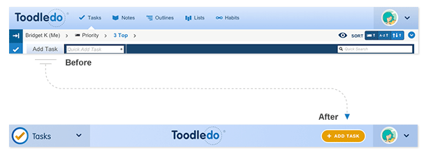 1) The "Add Task" button has been moved from the toolbar to the top of the page. The "Add" button for our other products has also been moved to the top of the page. We did this for a variety of reasons. First, this is the most important button on the page so we wanted to give it a more prominent location so that it was easier to locate and use. Second, as you may remember from our previous redesign steps, we are trying to simplify the page and get rid of the toolbar so we needed to move this button out of the toolbar. 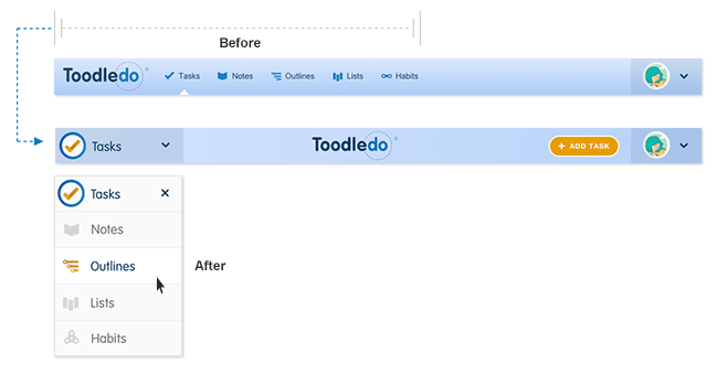 2) The links for switching between products (Tasks, Notes, Outlines, Lists, Habits) have been merged into a popup menu in the top left corner. Click the product name to refresh the page and click the down arrow to switch products. This product switcher already existed for people using Toodledo on mobile devices, but we decided to make it the default behavior for some good reasons. Our usage data showed us that most of our users do not use every one of our products, and they don't switch between products that often. So, we realized that it wasn't necessary to have the 5 product links visible all the time at the top of the page. By collapsing them into a menu, we have made the page less cluttered and we feel like the extra click that is now necessary to switch products is justified. Both of these changes were also done to make the website more "responsive". This is a term that means that Toodledo will work on mobile devices just as well as in the desktop browser. You can see this for yourself by resizing this window and making it really skinny. The top section should scale down appropriately. Our goal is to eventually have the entire site work well inside a mobile browser and we are making great progress in this direction. We have one more step in this transitional redesign, and that will be moving the "Quick Add" and "Quick Search" fields elsewhere on the page and getting rid of the toolbar. We already know how we are going to do this and will begin testing this with our Beta Testers soon. We also snuck in some smaller updates: 1) We have slightly changed the icon used for "file attachment" to make it easier to see when a task has an attachment. 2) We have changed the colors of the dividers between groups of tasks and updated the style of the sidebar to make it easier to see which list is selected. 3) The Habits section now utilizes the Ribbon more effectively by giving you a dedicated "Inbox" to show the habits left to complete today, as well as the ability to see the habits you have archived. 4) The Lists section has a new "Edit Columns" button that makes it a lot easier to add, edit, rearrange and remove columns. Please let us know here or in a support ticket if you have any constructive feedback. This message was edited Oct 26, 2015. |
|
Salgud |
Well, I guess you did ok, though I would have preferred it if you'd done it just the way I LIKE, using colors that I LIKE and fonts that I LIKE. And you added a couple of clicks to get to other features, which will consume each time an additional 0.0003 seconds of my working day! Could add up to almost a whole second by week's end! :)
Other than that, looks good, nice work! |
|
Jackie_1542664888 |
OK, I get what you are striving for, but, as you noted, the Add Task button is the most important button. You moved it VERY far away from all the other most used buttons. Perhaps on a mobile device it is close by, but on my computer, it is a long mouse ride over to it and then back to the tasks. There are plenty of places to put it that are just as prominent, but closer to get to. FAIL!
|
|
Ann M |
I would have preferred if the ADD Button was left justified and not right justified as now. As a result it is now further away from where it was making me use the QUICK ADD add as the default and then updating the relevant fields - more clicks. Otherwise I like the changes, especially hiding all the other products as I only use three of them.
Ann |
|
TheBrayingMule |
Same remarks as others. Good design overall but I would prefer "Add button" to the left.
See screenshot for exemple : https://www.evernote.com/l/ACaXedosBrJIJqFIlMkLJ8ewlVvOWICENKw Or let the user choose left or right :) This message was edited Oct 26, 2015. |
|
gmrevo |
Could u make a option, or even default to move to the left side? that would be great
|
|
bobmac1547_1391065183 |
Posted: Oct 26, 2015
Score: 12
Reference
Posted by Jake:
1) The "Add Task" button has been moved from the toolbar to the top of the page. The "Add" button for our other products has also been moved to the top of the page. We did this for a variety of reasons. First, this is the most important button on the page so we wanted to give it a more prominent location so that it was easier to locate and use. Second, as you may remember from our previous redesign steps, we are trying to simplify the page and get rid of the toolbar so we needed to move this button out of the toolbar. While I've acknowledged the improvements you've made as being good ones, I think you blew it on this one. Moving the "Add Task" button out of the toolbar is fine, but you did not recognize the value of "muscle memory" or "motor memory." In that, we have been used to clicking on the left side of the page to add a task. Moving the button to the left (just to the right of the dropdown menu--it's NOT a popup menu!) would involve people just moving the mouse a little north of where they're used to clicking. With your new design, we have to make a loooonnnnngggg trip over to the right side of the screen. And on today's wide monitors, that's a real hassle. |
|
kmasters9 |
I like the new direction you're taking with the design changes so far, but strongly dislike putting the "most important button" on the far right hand side. That's a highly unusual position for an important button, and I have to move my mouse a long ways. See what other companies with million dollar UX budgets do (e.g. Gmail, Hotmail, Office, etc). Upper left = new file, new task, new email, new calendar etc. Yes, I know there is keyboard shortcut, but sometimes I end up using the mouse.
Would love an option to move it back to the left! |
|
cwdouglas |
Very frustrating location for add task, two functions I do throughout the day...complete tasks and add tasks...why would you ever move the two so far away from each other. PLEASE PLEASE MOVE IT BACK!! I can work with all the other changes, but this is ridiculous.
|
|
kctwirler1_1378472738 |
Posted: Oct 26, 2015
Score: 6
Reference
I'm really loving all of the updates! Everything is more streamlined, and I'm finding it easier to move around the site.
I agree with the previous comments about the new location of the "Add Task" button, particularly the comment about "muscle memory." It feels very uncomfortable to have to travel to the other side of the screen to create a new task and then travel back to the left to edit the various fields. Moving the button the the top left of the screen (or making that an option) would be a lot more comfortable for many people! |
|
BobGott |
I really like this update .. with regards to the 'Add Task' button on left/right .. Either way .. I'm going to have to try it for awhile. Seems OK on the right.
|
|
CharleneTX |
Posted by Jake:
1) We have slightly changed the icon used for "file attachment" to make it easier to see when a task has an attachment. I don't have an opinion on the Add Task button as I've always used the quick add, but THANK YOU for the icon change. It's SO much easier to see now. Charlene |
|
Todd Elliott |
Ditto - please move the "Add" button back to the left!!
|
|
kkramer_1389721421 |
The other updates have been quite smooth and easy to adjust to, so even if I didn't particularly see a need for them it's all been fine and I do have to agree that it's a sleeker look now. With today's update, though, I have to object. I won't go too in depth because I'll just be repeating what others have said, but I strongly disagree with the decision to move the 'Add Task' button to the far right of the display. It is, as you said, a very important button. Given its importance, why has it been banished to the far right when the task bar, check-off and action buttons for tasks, and quick add window are all on the left side? There are very few items on the right side of the screen that I use day to day, so putting the most important button in no man's land like this is very jarring.
|
|
glparke |
Ditto on the Add Task Button on the left. This keeps the workflow left to right.
Thanks! |
|
Jake Toodledo Founder |
I just wanted to say that we are listening to people's feedback and are considering some changes.
Just as a further explanation, the "Add Task" button is in the same part of the screen as the task filters, sort options and action menu, so we didn't feel like we were banishing the button to an unused corner. The upper right corner is where you already go to make changes to your list, so this placement seems logical to us. We understand that there is muscle memory and accustomization that is being disrupted here and we want to be sensitive to this so we are exploring some other options right now. While we consider all this feedback, please try these two ideas: 1) Use the "Quick Add" box to add a task, which is in the same place it has always been, on the left. 2) Use the keyboard shortcut "n" to add a new task without having to move your mouse anywhere (you may need to enable keyboard shortcuts in your account settings) |
|
fiona.c |
Hi Jake,
I understand your 'logic' but really, I rarely make changes to the way my list displays. I have various searches set up and I use them to vary the way the list looks. I only really use top left stuff to make structural changes, as a one off. Not a daily activity. Most focus is on the top left... then down to review list (typical english speakers, left to right, top to bottom reading). As has been said, with widescreen monitors that top left is a looooooong way away. and if I have toodledo on the right hand monitor of my 3 monitor set up.... its just been banished to the faaaaar right, real estate rarely traveled by my mouse as if I decide to make structural changes to my searches (ie use those top right buttons) i'll move the window to my main monitor, make the changes and return it. BUT I add tasks intermittently during the day as stuff happens or occurs to me. Hope you can change this... Fiona |
|
postavenue |
As others have also posted, why move the "Add Task" button so far from the main section of the page, which for most of us has to be the left hand side. That is where the tasks are listed, the new dropdown, etc. Having to move all the way to the right makes no sense from a user standpoint. Maybe it is more symmetrical design-wise, but UI is not as easy. You might want to reconsider this move.
|
|
Acustk |
Clicking "Tasks" to refresh now collapses all the dividers. Before the product links were consolidated I could click on the "Tasks" link and it would refresh my page but leave open the dividers I was currently working in.
Would you please consider restoring this functionality? Namely, that if you are currently in the Tasks module and click "Tasks", it will refresh but not collapse all the folders. Thanks. |
|
kerrinhardy |
I'm really surprised by the number of people that seem to use the Add button. I've always used the Quick Add functionality and only recently discovered the Add button (as part of discussions on the forum)!
|
You cannot reply yet
U Back to topic home
R Post a reply
To participate in these forums, you must be signed in.