ForumsNewsToodledo Redesign - July 2011
Toodledo Redesign - July 2011
| Author | Message |
|---|---|
|
Jake Toodledo Founder |
Today we are revealing our third major redesign in our five years of existence. We hired our friends at ZURB to help make it possible, and we think that it looks really good.
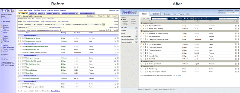 A lot has changed, and it may take a little getting used to. We have thought very hard about each aspect of the new design, and we are confident that Toodledo is now more efficient and more intuitive than it was before, which is what you want from a productivity tool. We had three criteria that we kept in mind when redesigning Toodledo.com. 1) Improve the look and feel and bring Toodledo into the modern era with a professional design that didn't look like it was made by engineers (I'm an engineer, so I can say that). 2) Streamline the user interface to reduce clutter and complexity. 3) Avoid increasing the "cost" of commonly used actions. We are defining the word "cost" to mean the amount of time or number of clicks that it takes to perform an action. For example, completing a task has a cost of "1 click" on the checkbox. If you consider it for a minute, you'll realize that #2 and #3 are at odds with each other. Reducing clutter and complexity will probably entail hiding some features that were previously exposed, which will increase the cost of those actions. We carefully weighed each element of our website and only made cost compromises when it was backed up by statistics or by making other improvements possible. We realize that you have spent a lot of time getting familiar with the way Toodledo works, and that this redesign may make you slower while you re-learn your work patterns. Please give yourself some time to become accustomed to the new workflow. We believe that with a little reacquaintance time, you will be more efficient and productive. We know that there will be a small percentage of people who dislike our new design. This is inevitable, but we are hoping that two things will help minimize the number of people in this group. 1) Our old design was really bad. [see screenshot above] The new design is such a huge leap forwards, that I hope people will appreciate it more than if we were just "rearranging the furniture" for the novelty of it. 2) Later in this post, I am going to go point-by-point and explain each of our design decisions. My hope is to make it clear that we did not make any change without thoroughly thinking it through with good data to back it up. If you feel like actions are slower than before, please read the section at the end of this post to see why we did certain things. People have been asking for a modern design for years, and we are very happy to finally have something to show for it. This redesign primarily focused on the home page, navigation, toolbars and notebook section. There is still more work to do over the coming months to improve the design of secondary pages, and to the display and management of individual tasks. So we aren't completely done, but we are well on our way. Thanks, Jake For a complete step by step justification of each design decision, please Read Here. This message was edited Jul 26, 2011. |
|
carlaxelfranzon |
Looks good in Firefox; the only problem I have (was with old one too is that it doesn't all fit on my screen horizontally.
Good work! Thanks for the continued improvements! |
|
Mike Holmes |
Great new layout! Much quicker to navigate. Thanks.
|
|
rparis58 |
Looks awesome. You guys are doing an excellent job. Very impressed.
|
|
pwwaring |
I'm sure there'll be a few kinks to work out along the way, but overall a great improvement - thanks!
|
|
jzamoras |
I got icons back, but I cant fit the screen horizontally too
|
|
Steve_1354340810 |
I like it!
|
|
Trelis |
Looks great! I am still hoping for the sort option per date sort, so I can sort events at-will on say "Today" or "Tomorrow".
|
|
garyo |
Woo hoo! Looks excellent. Can't wait to dig into it. I wondered why things had been so quiet around here... :)
|
|
howardksmith |
I was pleasantly surprised by the changes. Look (and work) great for me so far. I appreciate the effort.
|
|
Steve |
While I'm seeing some things that I like, I'd recommend an email warning so users could prepare for the change. It was very unsettling to refresh and suddenly see the new design.
|
|
BuSu_esm |
Posted by Toodledo:
Today we are revealing our third major redesign in our five years of existence. We hired our friends at ZURB to help make it possible, and we think that it looks really good. A lot has changed, and it may take a little getting used to. We have thought very hard about each aspect of the new design, and we are confident that Toodledo is now more efficient and more intuitive than it was before, which is what you want from a productivity tool. We had three criteria that we kept in mind when redesigning Toodledo.com. 1) Improve the look and feel and bring Toodledo into the modern era with a professional design that didn't look like it was made by engineers (I'm an engineer, so I can say that). 2) Streamline the user interface to reduce clutter and complexity. 3) Avoid increasing the "cost" of commonly used actions. We are defining the word "cost" to mean the amount of time or number of clicks that it takes to perform an action. For example, completing a task has a cost of "1 click" on the checkbox. If you consider it for a minute, you'll realize that #2 and #3 are at odds with each other. Reducing clutter and complexity will probably entail hiding some features that were previously exposed, which will increase the cost of those actions. We carefully weighed each element of our website and only made cost compromises when it was backed up by statistics or by making other improvements possible. We realize that you have spent a lot of time getting familiar with the way Toodledo works, and that this redesign may make you slower while you re-learn your work patterns. Please give yourself some time to become accustomed to the new workflow. We believe that with a little reacquaintance time, you will be more efficient and productive. We know that there will be a small percentage of people who dislike our new design. This is inevitable, but we are hoping that two things will help minimize the number of people in this group. 1) Our old design was really bad. [see screenshot above] The new design is such a huge leap forwards, that I hope people will appreciate it more than if we were just "rearranging the furniture" for the novelty of it. 2) Later in this post, I am going to go point-by-point and explain each of our design decisions. My hope is to make it clear that we did not make any change without thoroughly thinking it through with good data to back it up. If you feel like actions are slower than before, please read the section at the end of this post to see why we did certain things. People have been asking for a modern design for years, and we are very happy to finally have something to show for it. This redesign primarily focused on the home page, navigation, toolbars and notebook section. There is still more work to do over the coming months to improve the design of secondary pages, and to the display and management of individual tasks. So we aren't completely done, but we are well on our way. Thanks, Jake For a complete step by step justification of each design decision, please Read Here. Awesome This message was edited Jul 26, 2011. |
|
johnd1041 |
How can I add color back. I don't like the gray. I liked the old layout. I still have to check out the new features.
|
|
phicar2 |
I like the new look but my performance just tanked with the redesign. Before, refreshing was sub-second, now it takes 2-5 second to look at the "Loading..." message... I opend a ticket, hopefully there are some performance tweaks that can be made to fix this...
|
|
Casey |
One thing I'd like is the option to "tick" multiple folders the same way it is possible with tags and contexts.
The look is great. I like that the tabs are on the side so we can see them all. Especially like that the keyboard shortcuts (as far as I can tell) are unchanged. **Update . . . the subtask keyboard shortcuts aren't working. Any chance we can get those back? j - Flattened k - Hidden l - indented This message was edited Jul 26, 2011. |
|
Gvdmunt |
The look and feel is indeed improve. I hope only that the left pane also will able to hide. Currently it does not fit anymore on my screen.
Update: I made the columns smaller. It helps but still I cannot manage to get everything on the screen. Biggest point now are the 'column' for the add and edit column buttons. Idea to move them to the left side. There is unused space... This message was edited Jul 26, 2011. |
|
Allie Kern |
digging it so far!
|
|
rcurry71 |
I like it... but I would still love an A1, A2, A3, B1, C1 prioritization column (Franklin Covey Style).
|
|
daniele.matteucci |
Big shock for the first time: the grace violet has gone and now always is gray :(
Also, the left frame is very annoying on little screens, and there is no way to hide it :( Technically, I appreciate the improvement :) But PLEASE give me back the violet and the left menu hide! Many, many thanks :) |
|
isaachess |
I think the redesign is a small improvement at best. I'm surprised at the amount of clutter still on the screen.
One problem: when adding a task with a due date, if I type in the due date (such as "today") and hit "enter," it does not add the task as it used to do. (This is in Chrome.) This slows me down tremendously. Please fix this. |
You cannot reply yet
U Back to topic home
R Post a reply
To participate in these forums, you must be signed in.